Photo Shoppe Around The Corner

Welcome to Scrappers Alley Designs! 

http://www.scrappersalleydesigns.com/


     You have come to the right place if you're looking for Digital Scrapbook kits (full, mini, quick pages, etc.), elements, cards, inspirational notes, paper packs, ideas, tutorials, overlays, templates, brushes, and much much more.  Be advised that we're new to the internet having been scrapbook designers for such favorites as the Nuthouse, Kjoy, and currently and exclusively for iScrap that we haven't had the opportunity to venture out on our own.  We're doing that now.  And we hope you'll help us get off to a good start.  We would greatly appreciate your suggestions, tips, strategies, and advice in this regard.  We value your input.


     Stacey and I are both professional photographers and scrapbook designers.  I am also a writer and an artist.   Stacey is working on her bachelor's degree in web design.  So our NEW store, though under construction, is up and running.  I am so proud of her.  And if you haven't guessed, we're a mother/daughter team.


     While you're waiting, kick back and enjoy the view as we upload our products.  And do stop back again to see what's new, ask a question, learn some photoshop basics and tricks, digital scrapbook techniques, and swap ideas.  We love having you here.  The products cited on this private blog are available at our store at: 


    Thank you for stopping by. 


Blessings, 

Margo & Stacey 


Come see what's new in our Photo Shoppe Around The Corner.
(photo backgrounds, backdrops, album covers, cards, postcards, notes, buttons, business cards, and much much more.)

Saturday, December 11, 2010

Mega Kits

ALL KITS AVAILABLE AT:

Mega Kits are 12 x 12 inches square, 300 dpi resolution, in psd format. They include 8-10 papers, 20+ elements, and 1+ word art, and 3 or more quick pages. They retail for $9.99 and can be purchased at our store via the link above. Quick Pages may be purchased separately.

SA Love is in the Air - Mega Kit

SA Love is in the air - QP 1

SA Love is in the air - QP 2

SA Love is in the air - QP 3

* * *

SA Digger and Cricket - Mega Kit

SA Digger & Cricket - Quick Page 1

SA Digger & Cricket - Quick Page 2

SA Digger & Cricket - Quick Page 3

*  *  *

SA Timeless - Mega Kit


SA Timeless - Quick Page 1

SA Timeless - Quick Page 2

SA Timeless - Quick Page 3

* * *

SA Vacation Fun - Mega Kit

SA Vacation Fun 1 - Quick Page

SA Vacation Fun 2 - Quick Page

SA Vacation Fun 3 - Quick Page

* * *

SA Sweet Inspiration 2 - Mega Kit

SA Sweet Inspiration 2 - Quick Page 1

SA Sweet Inspiration 2 - Quick Page 2

SA Sweet Inspiration 2 - Quick Page 3


Monday, December 6, 2010

Mini Kits

ALL KITS AVAILABLE AT:


Mini kits contain an average of 4-6 papers & 10-12 elements including word art.   Each kit is 12 x 12 inches square, 300 dpi resolution, in psd format.  All elements are in png format.  Some word art and texts are in psd format so that you can replace them with your own journaling.

Each kit retails for $3.99 and can be purchased at our new store via the link provided above.

SA Lil Tike Snow Dayz - Mini Kit


SA Dress Up Days 2 - Mini Kit


SA Dis and Dot - Mini Kit


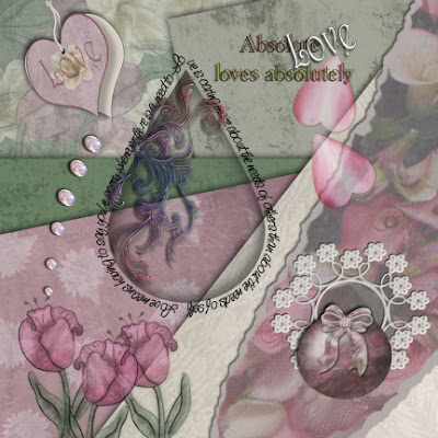
SA Absolute Love 2 - Mini Kit


SA Plum Pudding - Mini Kit


SA Kutie Pie - Mini Kit


SA Lil Tike - Mini Kit


Tuesday, November 23, 2010

Simple Photo Bubble Tutorial

Simple Photo Bubble Tutorial for Beginners and Intermediates
(A Photoshop Tutorial)


In this tutorial you will learn to make a photo bubble almost from scratch. You will learn to create new layers, duplicate old layers, blend and merge layers, cut and paste photos to your project and resize them, apply radial and Gaussian blur, create glass glare, bend a photo to fit a dome, name and rename layers, and much more.

Let’s begin.

Step 1 - Open up a transparent layer

It is best to use a high resolution square photo for this project. Mine is 5x5 inches, 300 dpi resolution, in jpg format.

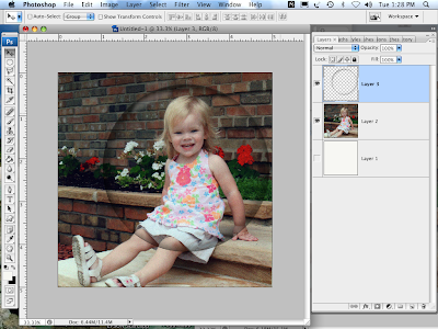
To begin, we need start our project with a transparent layer. In the Photoshop menu bar, select "File" then click "New." In the drop-down menu set your image size to 6x6 inches at 300 dpi resolution. We will also need a colored background layer to display our work. We can create a new layer by selecting the "Layer" option in the menu bar and clicking "New." Paint this layer white using your "Paint can" tool in your tool bar. Make sure your foreground color in your tool bar is "white." We're going to hide this layer temporarily. Click the "eye" icon to the immediate left of Layer 1 on your Layer Pallet. It will disappear.

We're ready for your photo. If you have not cropped or resized it to fit, you can do so now. Open up your favorite jpg, psd, or png photo. To crop it, select the "Crop" tool in the tool bar (it's usually the 4th icon down from the top). At the top of your screen, beneath the menu bar, you will see two boxes. One labeled "Width" and one labeled "Height." If empty, type in the number 5 in the width box and tab over to the Height box. Type in the number 5 there also. Then tab once more to set. If numbers already appear in these boxes, simply delete them and type the number 5 in both boxes. A box with circles will appear on our photo. Using your "Move" tool from your Tool Bar (the first icon), mouse to anywhere within the box and move the box until it fits over that part of the picture you want centered. Then click on the "Move" tool in your Tool Bar again and select "Apply" when prompted. To reset the resolution select "Image" in the menu bar, then "Image size." A drop-down box will appear. In the "resolution" box change the # to 300. Note that if you are increasing the resolution from your original size you will lose pixels and decrease the quality of the photo; it's best to start with the appropriate size. Click "ok."

Once your photo has been cropped and resized to fit this project, you can now drag it to your new layer. Use your "Move" tool to drag it and center it. This layer will be labeled "Layer 2."


Step 2 - Make a duplicate copy of Layer 2.

In most cases I always duplicate the background or main layer of every project in the event I mess up along the way. And believe me, I DO mess up on occasion. You will too. Keeping the original and using the duplicate copy prevents you from having to recrop, resize, and basically start over from square one. In this case, however, our purpose for duplicating this layer is twofold as you will see. To duplicate this layer, go to “Layer” option in your menu bar and select “Duplicate Layer” in the drop-down menu. You can rename the duplicate layer here if you would like or you can do it later. I will leave mine as “Layer 2 Copy.”

Step 3 – Adding a Transparent Photo Bubble

I am using one of my own bubble templates from my handmade library. You may use one of your own or copy mine, which is available free of charge on my blog at the address below.


Drag your bubble on top of your “Layer 2 Copy” and then center it on your photo so that your subject is the center spot of your bubble. Don’t worry if your bubble photo at this point is not centered on your page. We will fix that in a moment.

Step 4 – Cutting Your Photo To Fit

There are several ways to make your photo fit your bubble. . . including shortcuts for this process. I have elected to erase the excess photo outside of my bubble using my "Erase" tool and the #100 airbrush at 100% opacity. I prefer the soft orb it leaves behind tight against the bubble, which will give my finished product a soft, dimensional look when I duplicate it.


Roll your eraser tight around the bubble's edge, then erase the remainder of the picture outside of the bubble.

As a general rule I ALWAYS stroke each layer to make sure there are no loose pixels floating around. You can achieve this by selecting the “fx” icon at the bottom of your Layer Pallet and selecting “Stroke.” Do not change the settings. Simply click “OK.” You will now see your photo surrounded by blotches of red. Erase all but a thin line directly around your photo. When you are finished, click the “eye” icon to the left of your “Stroke” label just below Layer 2 Copy on your Layer Pallet. This will deactivate it and make the red go away.


At this point it’s important that you SAVE your project. You’ll want to save your work often during the course of your work.

Step 5 – Centering your photo and bubble

With your “Move” tool, drag Layer 2 Copy to the center of your page. Do likewise for your bubble layer (Layer 3).

Step 6 – Duplicate and shrink the new layers

We are going to duplicate Layer 2 Copy and Layer 3 because we will be working on each layer independently. Duplicate Layer 3 first. It will appear as Layer 3 Copy in your layer pallet. Drag it on top of Layer 2 Copy.


We need to shrink this layer and keep it centered above the previous layers. In your “Edit” option on the Menu Bar, select “Free Transform” from your drop-down menu. A box with circles will appear around your bubble. Drag any one of the circles towards the inside of the box to shrink it. I use the corner circles alternately until I have achieved the size I need.

When your bubble is the size you want, you can drag it to the center and make adjustments as needed. When finished, click on the “Move” tool again and select “Apply” when prompted.


We will need to duplicate Layer 2 Copy as well and repeat the above process so that your new layer (Layer 2 copy 2) photo is centered perfectly inside your duplicate or inner bubble. I like to HIDE Layer 2 so that I can see what I’m shrinking. To hide the layer, simply click on the “eye” icon to the immediate left of Layer 2 on your layer pallet. Click on it again when you want to make it visible.

Step 7 – Applying Radial Blur to both photo layers

We need to give our photo some dimension in order to give it the appearance of being inside a bubble--not just underneath it. To do this we will add some movement to our photo layers.


Hide Layer 2 Copy 2 and then select Layer 2 Copy because we are going to give it some radial motion. In your menu bar select “Filter.” Scroll down to the “Blur” option and then choose “Radial blur.” A pop-up menu will appear. Set the Amount to “5” and leave the remaining settings set to Spin and Best. Hit “Ok.”

Your photo should look something like this:


Now unhide Layer 2 Copy 2 and select Layer 2 Copy because we’re going to repeat this process on the smaller photo. . . but at a lower setting. Under “Radial Blur” change the Amount to 2 and click “Ok.”

Your photo should now look something like this:


Step 8 – Creating a Dome Effect

Since bubbles are round, we want to create a dome effect on our two photo layers. First, let’s hide the small bubble (Layer 3 Copy).


Now using your “Dodge” tool and #100 airbrush set to 453, Midtones, 67% Exposure, paint gently in circular motion the center only of Layer 2 Copy 2. It will lighten as you brush.

Step 9 – Blending the two photos and preparing to Trim and Pop

We’re now going to blend our two layers so that they are smooth and seemless. First we’ll need to HIDE our top bubble layer. Then we’ll need to select Layer 2 Copy 2 so that we can blend this layer into the one directly below it.


Using our “Eraser” tool and brush #100 airbrush with the opacity set to 50%, gently paint around the edges of your photo in a slight wavy motion until it blends well with the layer below it.

When you are satisfied with the outcome, select both photo layers (Layer 2 Copy and Layer 2 Copy 2). Make sure both layers are highlighted. Then merge the two layers together. To merge, right click and select the “Merge Layers” option at the bottom of the drop-down menu. Rename this layer “Photo 1.” To do this, gently double click on the title of the current layer and retype the new title.

Now for the tricky part.

Step 10 – Out of the Box - Trimming and Filtering

We’re going to copy this layer (Photo 1) to a new file. Open a New Photoshop file and set it to 6 x 6 inches, 300 dpi resolution, transparent. Return to your project, highlight the layer “Photo 1” and drag it to the new file. If you forgot to “Stroke” this layer, you can do so now. We want a clean copy because we’re going to TRIM it.


In the menu bar, select “Image.” Then select the “Trim” option from the drop-down menu. This will automatically trim your photo tightly within the transparent frame. Now to resize it so that we can Liquify it. Again in the “Image” option, select “Image Size.” Change the width to “1” and leave the remaining settings as they are. Make sure all the bottom boxes are checked.

Step 11 – Liquify and Bloat

I remember when I first discovered Filters. Oh what fun I had. And I have to be honest and tell you that 14 years later I'm still learning what these filters do. It's like a new toy every time I venture in the Filter "room" as I call it. I hope the experience will be as exciting for you. Let's play.


Go back to the menu bar and select “Filter.” In the drop-down menu, select “Liquify.” We will need to pop the picture out so that it looks slightly DOME-ish. This will take some practice as the brushes here are rather touchy.

Select your “Bloat” tool from the tool bar. Then set your brush size to 360. Leave the remaining settings as they are. Now gently hovering above your photo, find the center. Then click ONCE. Note the effect before clicking again. When you’re comfortable, repeat the click as often as needed to achieve the dome effect you want. I have clicked 3 times. Click “Ok” when you’re finished.

Step 12 – Returning and Resizing

We will need to drag this photo back to our original project and resize it. Simply drag your domed photo using the “move” tool. Center it in the middle of your bubble. Now select the “Edit” option from your menu bar and the “Free Transform” option from the drop-down menu. Resize your photo to fit inside the bubble like before, then “Apply.”

Step 13 – Glare and finishing touches

Now for the finishing touches. This can be tedious but always a ton of fun for creative non-genius in me.

Create a new layer ABOVE your bubble layer (Layer 3 Copy) which is still hidden. Name this layer “Glare.” With a hard, crisp brush and your foreground color to WHITE, draw glares at top left and lower right on your bubble. I used “Hard mechanical #60 for the top and decreased the size to 30 for the bottom.

In the “Filter” option, select “Blur” then “Radial Blur.” Set the Amount to 10 and leave the remaining settings as they are. This will give our bubble a glass glare effect. I like to Gaussian blur it a tad after this. I set the Gausian blur to 7.4 to create the effect you see here.

I like to repeat this step except that I draw other glare-type effects (See example). I then change the opacity of this layer only to achieve a softer glare.

You can now hide layer 2 and then add any finishing touches you want on any given layer. I have added a new layer and painted some white splatter around the edges. You can do the same. Create a new transparent layer. Then using a splatter brush (I’ve used Splatter Brush #39 and set it to size 187 at 54% opacity I simply dabbed in some white flecks randomly around the edge.

Voila!

I hope this tutorial has benefited you. It was a lot of fun to do. There are of course lots of tricks, shortcuts, and actions that can produce similar effects. But since I instruct Photoshop Newbies and Intermediates I like them to experience all the wonderful tools, effects, and possibilities Photoshop has to offer. Once you learn the basics, you can go on to create anything.

Blessings,
Margo


You are more than welcome to copy the bubble template directly above.

Wednesday, November 17, 2010

Rip it - Tear it Tutorial

Rip It/Tear It Tutorial - Torn paper edges with 3D effects


In this tutorial you will learn how to make torn paper edges and torn paper.  The procedure is rather simple although a tad lengthy.  But once you get the hang of the technique you’ll be tearing everything like a pro.

Step 1 – Choosing and resizing your paper

I started my project with a vintage floral paper in my inventory.  You can choose any paper you like for your project. 

Resize your paper if necessary to fit your project.  I’m using paper that is 6 x 6 inches square, 300 dpi resolution.

Step 2 – Duplicate this layer

Sometimes this layer will be locked and you’ll need to duplicate the layer.  But as a safety measure, in the event I mess something up along the way, I duplicate my background layer and always work on the copy.   Be advised that it is vital that you save your work often.  I’ve been caught off guard a time or two and had to start my project from the beginning because I forgot to save it along the way like I should have.


In your menu bar, click on “Layer.”  Then in the drop down menu select “Duplicate layer.” 


 This drop-down menu will appear.  You can rename this layer if you want.  I have not done so in this project.  Then Click “OK”


 Notice in your Layer’s Pallet that a duplicate copy now appears.  You have the original background layer and a background copy.

Step 3 – Create a NEW, transparent layer

Since I am making a frame I want to be able to slide a photo behind the top layer.  To do this I will need to create a layer in between the two layers.


Click on the “Background” layer.  It will highlight.  Then return to the menu bar and select “Layer.”  At the drop-down menu select “NEW.”


You can rename this layer if you’d like.  For this project I will leave it Layer 1.  Make sure the “Color” is set to “NONE” as you want a transparent layer.  Leave the “Mode” set to “Normal.”

Note that a new blank layer has been added to  your Layer pallet.

Step 4 – Coloring the new layer
  

With your mouse, move on over to your “Tool pallet” and select the “eyedropper.”  We’re going to want to color this layer.  For the purpose of presentation I like to choose a color from my original background so that it coordinates well with my project.  It this case, I have selected the lightest blue from my original background.  Drag your eyedropper anywhere on your paper to select a color and then click on it.

Return to your “Tool pallet” and click on the “Paint bucket” icon.  Then click anywhere on the new layer and click (Make sure the new layer is still highlighted).
  

You will not see this layer because it is hidden between your original background and background copy layers.  To view this layer, you must first hide the layer above it.  Simply click on the “eye” icon to the left of “Background Copy” layer on your Layer’s pallet.  But remember to re-click it when you’re done viewing your new layer.

Step 5 – Cutting out the frame

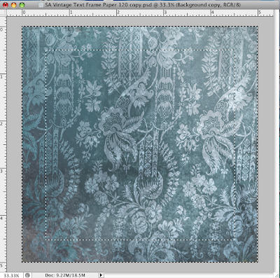
Highlight the “Background Copy” layer in your layer pallet.  Then mouse over to your “Tool pallet” and select your “Rectangular Marquee Tool.”  I’m making my frame one inch wide.  Click on the top left corner of your layer and drag your “marquee” all the way to the right hand bottom corner.  You will notice a dotted square surrounding your layer.  Return your mouse to the one inch mark at the top left (make sure your ruler is visible.  If not, click on “View” in your menu bar and select “Ruler” in the drop-down menu.)  Now,  and here’s the tricky part, while depressing your “ALT” key the entire time, drag your mouse to the one inch ruler mark in the bottom right hand corner.  Adjust it by dragging it if need be.  Once you have it in place, release the “ALT” key and release the mouse.  You should now have two blinking, dotted squares on your paper like the sample below.


 Mouse on up to your menu bar and choose the “Select” option, then in the drop-down menu, select “Inverse.”  You’ll notice that the outside square is now missing.  Do not panic.  This is supposed to happen.  When you use the “Invert” option, it reverses the original process by framing the part of the paper that you want to eliminate.


Return to the menu bar.  Select “Edit” and then “Cut.”  Your project should look like mine below.


Step 6 – Torn edges . . . but first . . .

Before we can begin tearing our inside edges, we need to make a duplicate of our “Background Copy,” which is now our frame.   Follow the same procedure above as you did to make the background copy.  Note that the duplicate copy will now read “Background Copy 2”  in your layer’s pallet.


Hide this layer by clicking the “eye” icon to the left of this layer in the layer’s pallet.  Then click on the “Background Copy” layer because we have to lighten this layer considerably since it will now be the bottom layer of our frame.  In your menu bar, select “Image” then “Adjustment” then “Levels.” 


 At the “Levels” option, adjust your output level by sliding the arrow to the right.  You want this layer to be quite light since it is going to be the torn edge of your frame.  I have set my output level to 240.  But you can choose a level suited to your own project.  Then press “OK.”  When you have completed this, return to your “Background Copy 2” layer and click the empty square to the left of the layer in the layer pallet to reactivate that layer.  Click on the layer itself so that it is highlighted.  We will be working on this top layer next.


In your “Tool pallet” select the “eraser” tool.  I used my Splatter brush # 14 set to size 60 at 100% opacity for this project.


I like to use a wavy, zig-zag type motion along the edge to give the edge a torn look.  Continue in this manner all around the inside edge of your frame.  Once complete repeat this process on your “Background Copy” layer that you lightened previously.  Make sure that layer is highlighted.  I like to use a smaller eraser brush for this layer.  I have set mine to size 42.

Your project should now look like this:


Step 8 – Adding Depth

To give your frame depth, you can “Bevel & Emboss” it.  This will be done on your “Background Copy 2” layer (make sure it’s highlighted in your layer pallet.)  Select the layer icon “fx” at the bottom of your layer pallet and then “Bevel & Emboss.”  A pop-up menu will appear.   I have used  the following settings: 


(Style: “Inner Bevel”, Technique: “Smooth”, Depth 1%, Direction Up, size “2” px.  Leave everything else at the default.)

Step 9 – Clean-up

I like to clean up my work as I go to make sure there are no stray pixels running about.  I do this on every layer.  This gives your work a professional quality.  To accomplish this,  highlight the layer you want to clean up, then return to the bottom of your layer pallet and select the “fx” icon.  Now select the “stroke” option.  You will notice that your edges are surrounded in red.  You will want some stray pixels around your torn edge because those are necessary to create the torn edge look.  Omit the red pixels farthest out from your edge that are just wandering around loosely or in clumps.  See the example below.


Using a soft eraser brush from your “Tool pallet,”  (I used soft brush #14),  Erase the stray pixels for a smoother look.  Repeat this process on all layers.  When complete, hide the stroke by clicking on the layer effect titled “Stroke” beneath each layer you’ve cleaned up.  The red will disappear.

Step 10 – Adding Torn Pieces to your paper’s edge


I like to add torn pieces to my edge to give it that realistic look.  This is easily accomplished by selecting your “lasso” tool form your Tool pallet and drawing a squiggly-type line around a random edge of your “Background Copy 2” layer.  Make sure to circle the entire edge at the bottom.  Mouse up to your menu bar, select “Edit” and then “Cut.”    Now create a new  transparent layer as you did earlier in this tutorial. You will paste your cut piece on the new layer.  Return to “Edit” and “Paste.”  Now drag your piece into place on your frame.


Your cut piece will be hard to see because it matches the background.  So I like to decrease the opacity of my previous layer temporarily.  This can be done by highlighting your “Background Copy 2” layer and then selecting the “Opacity” setting at the top left of your layer pallet.  I’ve set mine to 50%. 


Now I will adjust the piece so that it’s not so straight to give it a raised look.  In your menu bar, select “Edit” then “Free Transform.”  A box with circles will appear around your piece.  Rotate the piece slightly on an angle by mousing just outside the lower bottom, right circle until a curved line with arrows at each end appears.  Drag your mouse slightly upwards to the right.   Now mouse over to your “Move” tool (the top icon) on your tool pallet and select “Apply” on the drop-down menu.


Now to give your tear some depth.  At the bottom of your layer pallet, select the “fx” option and then “Drop Shadow” in the pop-up menu.  We’re going to add a shadow.
I’ve used the following settings:


(Blend Mode: “Multiply”, Opacity “75%”, Angle “129”, Distance “10” px, Spread “1” %, Size: “10” px.  Leave everything else at the default settings.)

I prefer to  add a little more dimension to my torn piece by dodging it horizontally.  But before I do that, I like to restore the opacity of the previous layer.  Highlight your “Background Copy 2” layer and slide the Master Opacity bar back to 100% at the top of your Layer pallet.  Then return to your top layer where your piece is.  Now in your Tool pallet, select the “Dodge tool.”  I used size 90 soft brush for this task at 100% opacity.  Then drag your mouse horizontally across your torn piece.  You may have to drag it back and forth a couple of times to achieve the effect you are looking for.

Zoom in on your piece so that you can blend and adjust more easily.


Since we rotated our piece off center, you can see that it doesn’t blend well at the top.  Here we can make adjustments.  I will drag the piece a tad upward until the colors blend even though the edges will remain rough.  See below.


Now I will darken the top edge of the piece to match the background.  In your Tool pallet, select your “Burn Tool” and a soft brush.  I used soft brush #45.  Then drag your brush lightly over the top edge until it blends with the background.  See below.


Now we’ll want to smooth it.  Return to your Tool pallet and select the “Blur Tool.”  I set my soft blur brush at size 22, 100% opacity.  Then blend the top edge of your torn piece until it blends well into your background as I have done below.


Play around with these three techniques until you achieve your desired effect.  Make as many of these pieces as you want along the torn edges of your paper.

Step 11 – Finishing up

At this point I like to add my finishing touches to my project, such as adding a nice grunge overlay on my solid layer.   when I am finished making my final changes, I merge both “Background Copies” and save my project.  To merge these layers, you will need to highlight both layers, then right click your mouse and select “Merge Layers.”  Your finished project should look something like this.


I hope this tutorial has been helpful. There are various ways and shortcuts for accomplishing these effects.  But if you’re just starting out, this tutorial should benefit you by familiarizing you with the various tools, their names and functions,  and familiarize you with some very basic procedures.  Once you know these, you can do most anything.

Blessings everyone!

Margo